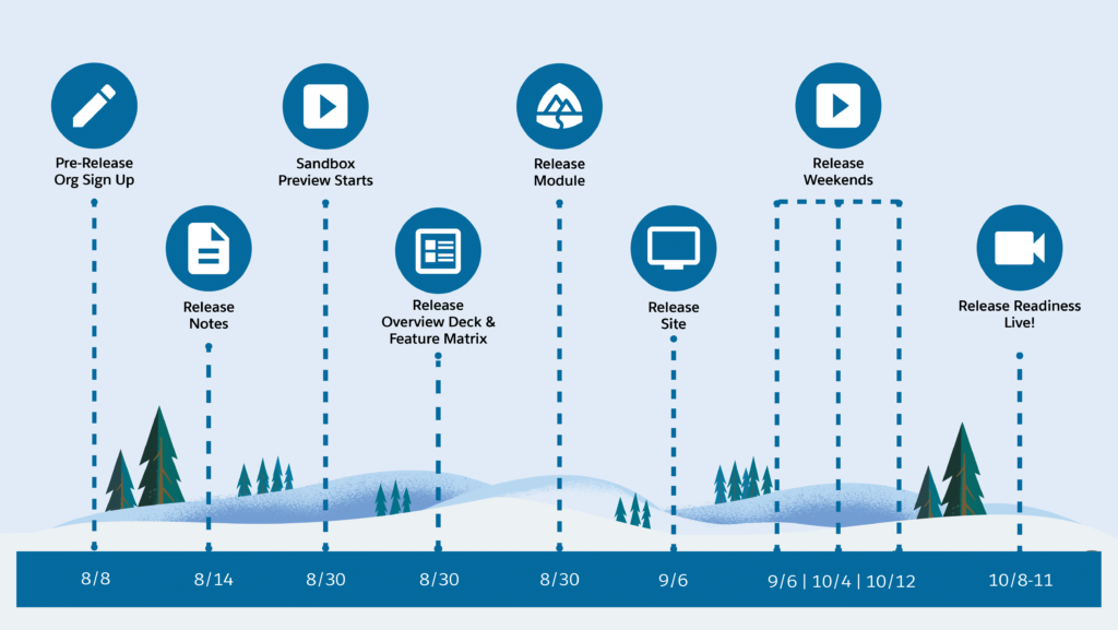
Salesforce Winter 25 preview orgs will be available for signup on August 8th, allowing users to test these new functionalities before their official release. This is the perfect time to discover how to leverage these upcoming features once they go live.
If you’ve previously registered for a preview org, you can access these features before August 8th. However, new users will need to wait until signup opens. Let’s look at the Winter 25 release timeline and then dive right into the cool new set of features.

1. Updated Setup Menu Dropdown
Let’s start with a nice, small change and that is the new Setup Menu title at the top of the Setup dropdown. This puts it visually inline with the App Launcher dropdown which does the same thing.

No functionality changes to see here! Just a visual alignment which is always nice to see. A sign of things to come given the focus on enhancing the Setup experience!
2. Dynamic Highlights on Dynamic Forms
The Dynamic Highlights Panel allows you to dynamically display fields in the highlights panel in your Lightning Pages, rather than being forced to use the old school Compact Layout and Highlights Panel which were used back in the Page Layouts era.
This new panel further enhances your Dynamic Forms and you can easily drag and drop fields directly on it while editing the Record Page. As you might have guessed, the fields can also be filtered based on the criteria of your choice. For each Dynamic Highlight Panel, one Primary Field has to be selected, and it is recommended to keep it as the record’s Name since this will be the header.

You can also configure the Dynamic Highlights panel for the mobile app, granting further customization to the mobile Record Pages. Keep in mind that the “Visible Action Buttons” can be configured for desktop only, as mentioned in the builder as well.

In other news, it appears the Dynamic Related Lists component is still not mobile-friendly which is quite unfortunate.
3. URL Slugs in Object Manager
You can now manage the URL Slugs for Experience Cloud LWR Sites in the Object Manager.

This is available to users at the bottom of the left-side menu.
4. Errors and Warnings Menu in Flow
Errors now get their own dedicated menu within Flow Builder. Now if you’ve written a formula incorrectly or forgotten to provide a value somewhere in your Flow you will see it in this new menu.

Additionally, the Auto-Layout and Freeform toggle has been moved to the left-hand side of the menu bar next to the new Errors and Warnings menu.
5. Changed Flow Save Menu
There have been some changes to the way Flows are saved inside the Builder. Now you can save your Flow, as well as Save As a new version or new Flow from a dropdown button rather than the legacy popup modal.

Another small change that saves a few seconds here and there that will add up to a more productive day!
6. Flow Action Buttons are Generally Available
One of the biggest enhancements in the previous Summer ‘24 release was the introduction of Flow Action Buttons.

Winter ‘25 moves these to Generally Available, removing the beta flag and also adding the ability for these buttons to be disabled.

7. User Management Enhancements
We’re seeing some of the major enhancements to security and access management in Winter ‘25, the biggest that I’ve seen so far is the ability to see where the access to a certain permission, Object Permission or even Field Permission is coming from!


Clicking the “Access Granted By” on the item of your choice will bring up a pop-up where you can see the Permission Sets, Permission Set Groups, or Profile that the access comes from – no more time spent searching for these!

Another new enhancement is the option to update the User record from the User Access Summary page.

We’re expecting the entire User management experience to be overhauled following the TrailblazerDX announcements back in March. More to come!
8. Enhanced User List in Setup
The User List View has a new enhanced mode in Winter ‘25 which gives it a modern UI and allows you to configure the List View in the same way that you can across the rest of Salesforce.

As mentioned above, we’re expecting a lot more enhancements to User management – this is just the tip of the iceberg.
9. Flow Repeater Enhancements
The Repeater component for Screen Flow has been upgraded allowing you to prepopulate data and present it to users within the Flow instead of requiring them to create the data.

Additionally, you can now control whether users can add their own items or not, and whether they can remove prepopulated items or not which essentially allows for a read-only Repeater in addition to the editable one.
If only we had an editable Data Table component in addition to the read-only one…
10. Flow Transform Element Enhancements
Last but not least is an enhancement to the Transform element that a lot of Flow enthusiasts have been waiting for – additional data types are now available to be used as Target Data values.

Previously, users were restricted to just Record and Apex-Defined, but now have as many options as there are variable types – a very useful upgrade.
Summary
And there you have it! These are my favorite features (uncovered so far!), including a few that I’ve read about but have not yet been lucky enough to get my hands on. As usual, there are a handful of more significant upgrades and a plethora of smaller ones that are going to make for an even more polished experience for admins, developers (both declarative and programmatic), and end users alike.
I’m sure there are a lot more User management and Setup features that I’m yet to uncover, as this has been a key area of focus for the Salesforce development team. These changes are always extremely well received by admins, developers, and users alike as they help create a sense of seamlessness for the entire core product.

